



You can tell a lot about a developer from the tools they use. Editor, OS, language, framework. Everyone has a side, and everyone is a little suspicious of the other side’s choices. Version control is no exception. Ask a GitHub team and a GitLab team how they ship software, and you will get two pretty different descriptions of what normal looks like.
But do these preferences (and their downstream impacts) actually show up in delivery metrics? Each VCS attracts a certain kind of team, and each platform builds features to reinforce those tendencies. If teams really do self-select based on their priorities, then those priorities should show up in the delivery data.
In this issue of Confident Commit, we break down data from our most recent State of Software Delivery by code hosting platform to find out.
The evolving source of truth
Git has been the foundation of collaborative software development since Linus Torvalds created it in 2005 to manage the Linux kernel. It quickly became the industry standard, displacing older centralized systems like Subversion and CVS.
Hosting platforms arrived shortly after to enable team collaboration at scale. GitHub launched in 2008, Bitbucket the same year (acquired by Atlassian in 2010), and GitLab in 2011. Between them, these three cover the vast majority of professional engineering teams today.
Despite sharing the same underlying technology, these platforms evolved to serve different kinds of teams and workflows, making unique design choices along the way:
GitHub is built around pull-request-driven social coding, making it the natural home for high-velocity, branch-heavy workflows.
Bitbucket is tightly coupled to Jira and the Atlassian suite, attracting teams that prioritize rigorous change management and cross-functional visibility.
GitLab serves as an integrated, governance-first platform appealing to teams that require strict, centralized control over security and compliance.
Given those philosophies, you would expect GitHub teams to iterate fastest, while Bitbucket teams move with more deliberate enterprise ceremony. GitLab teams, often working in complex and regulated environments, should land somewhere in between.
CircleCI integrates with all three platforms, so we can test those expectations directly to see if they hold up. Let’s take a look at how the hosting platforms stack up across the four key software delivery metrics.
Duration: how long is the feedback loop?
Duration measures the time from when a pipeline starts to when it finishes and determines how long a developer waits to find out whether a change passed or failed. Teams optimizing for rapid iteration want this number as low as possible. Teams running deeper validation, with more extensive tests and approval gates, accept longer durations in exchange for higher confidence in what they ship.
Workflow duration is generally consistent across all three platforms. At the median, the three cohorts are within a few seconds of each other: GitHub at 2m 58s, GitLab at 3m 4s, and Bitbucket at 2m 58s.
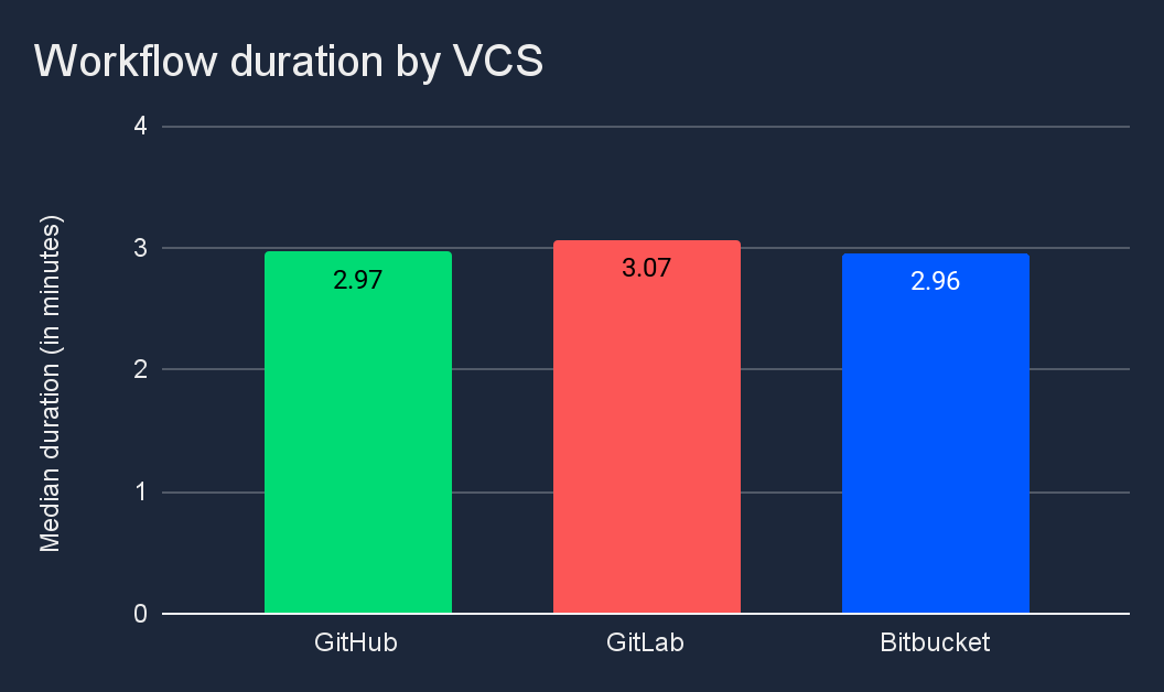
GitLab teams running slightly longer workflows is consistent with the hypothesis that these teams run governance-heavy pipelines, but the overall story here is similarity rather than divergence. Even at p90, pipeline durations are closely clustered at 493, 489, and 484 minutes respectively.
Throughput: how much is moving through the pipeline?
Throughput is the number of workflows a team runs per day. It can reveal how actively a team is pushing changes, and is often used as a directional indicator of team productivity.
Looking across all branches, Bitbucket teams run 1.71 workflows per day, while GitHub teams run 2.25 and GitLab teams 2.55.
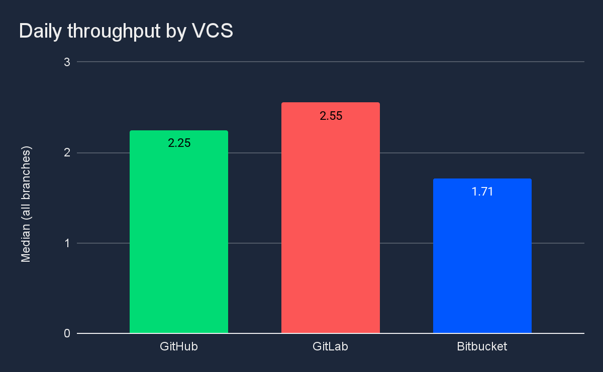
But the branch-level breakdown is where the numbers get interesting. Throughput on feature branches tells a story about iteration speed: how often developers are committing, running CI, and testing changes before they are ready to merge. On the main branch, throughput is a proxy for how often code moves toward production. Given what we know about each platform’s user base, you would expect GitHub teams, as the most iteration-focused cohort, to lead on throughput.
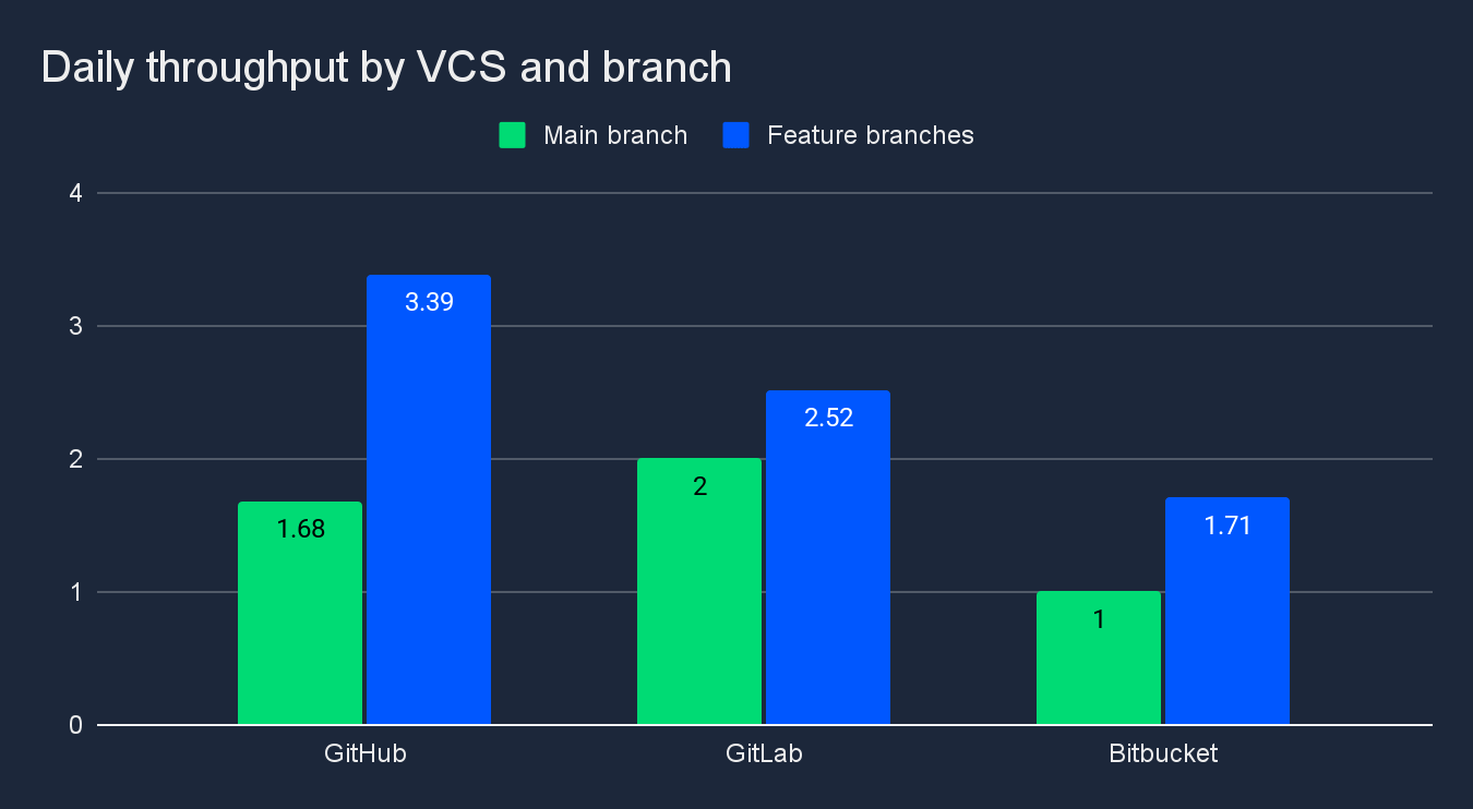
As expected, GitHub is the runaway leader on feature branches at 3.39 workflows per day versus 2.52 for GitLab and 1.71 for BitBucket. This makes sense considering GitHub’s user base skews toward smaller teams, open-source projects, and startups that prioritize iteration speed over formal approval processes.
But on the main branch, GitLab teams run the most workflows at 2 per day compared to 1.68 for GitHub and 1 for BitBucket. While this runs contrary to what we might first expect, the finding is consistent with previous research we’ve done showing compliance-heavy teams shipping more frequently but hitting friction in other areas of the SDLC (more on that below).
Success rate: how healthy is the path to production?
Success rate is the percentage of workflow runs that complete successfully. The default branch is where this metric matters most. Teams with efficient delivery processes catch errors locally or on feature branches before merging, so a high success rate on main is a signal that the upstream process is working.
Average success rate on main-branch workflows is highest for Bitbucket teams at 73.7% and falls to 70.6% for GitHub and 61.3% for GitLab.
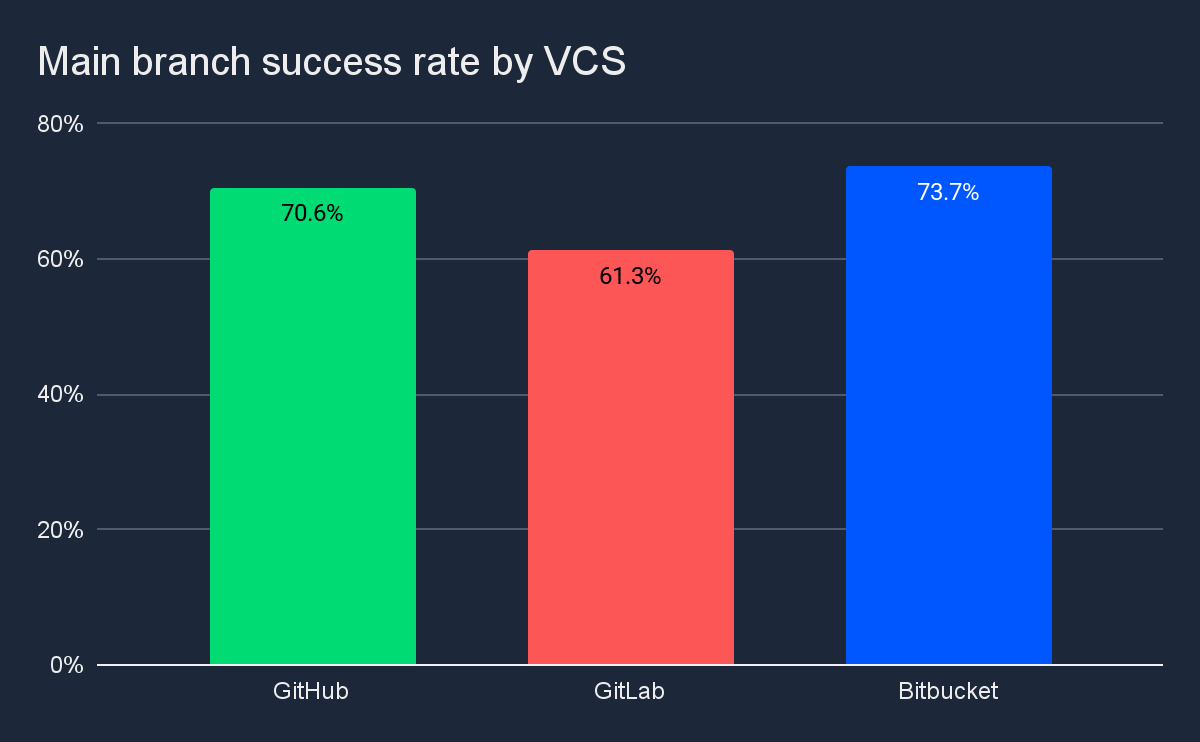
Bitbucket teams running the fewest pipelines but passing more of them is consistent with a stability-leaning culture where more review happens before a merge. GitHub sits in the middle, reflecting a culture comfortable operating at tempo while keeping things green. GitLab’s lower success rate likely reflects the complexity of the environments these teams operate in, something the recovery data makes even clearer.
Time to recovery: how long until you’re back to green?
Time to recovery measures resilience: how long it takes to fix a broken build and get back to a successful state.
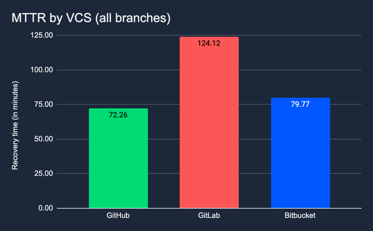
Across all branches, GitHub teams recover in 72 minutes, Bitbucket in 80, and GitLab in 124.
On the main branch specifically, those differences are magnified: GitHub teams recover in under an hour, BitBucket teams take about 80 minutes, and GitLab teams require nearly 8 hours to get back to green.
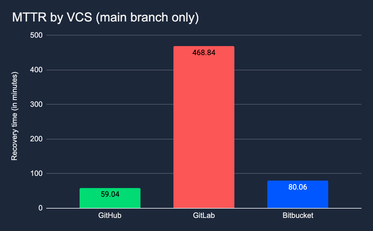
This may seem like a large delta. However, these results are consistent with what we’ve seen previously regarding high complexity, compliance-heavy workflows. When things go sideways on main in a complex environment, the need for more extensive root cause analysis, documentation, and verification before merging a fix can add significant time to the recovery process.
Of all four metrics, time to recovery is where the self-selection pattern shows up most dramatically. The teams who chose the governance-first platform are the ones paying the governance tax on recovery.
What did we learn?
While impactful, tool choices alone are never the determining factor for how a team performs. Most of that comes down to experience, engineering vision, processes, and how you use the tools at your disposal. But it’s also true that teams gravitate toward the tools that map to their way of doing things, and over time, those choices become part of a team’s identity.
Each cohort’s delivery performance aligns closely with what their platform was designed to support. Teams self-select into the tool that matches their priorities, and those same priorities show up in the data.
GitHub teams prioritize velocity: more feature branch workflows, faster iteration, quicker recovery. This tracks with GitHub’s pull-request-driven culture where branching is cheap, experimentation is encouraged, and speed matters more than gating every change.
Bitbucket teams prioritize stability: fewer workflows, highest success rate on main. The Atlassian ecosystem emphasizes structured workflows and cross-functional coordination. Teams catch more issues before merge, but that deliberation costs iteration tempo.
GitLab teams prioritize governance: most main-branch workflows, longest recovery times. This reflects GitLab’s governance-first design. Teams in regulated environments often ship frequently despite their additional constraints, but when things break, the overhead of meeting compliance requirements extends recovery.
Each platform attracts teams with different priorities, and those priorities shape delivery outcomes. So while your VCS doesn’t determine your delivery destiny, it does reflect the outcomes you’re optimizing for.
Go deeper
VCS choice is one way to see how different choices and team characteristics shape delivery performance. The 2026 State of Software Delivery takes a deeper look at what drives these differences, cutting the same metrics by team size, industry, and geography to show how delivery patterns shift depending on who you are, where you are, and what you are building.
Download the report to see the full analysis, or explore the data and benchmark your team against similar organizations in the interactive Software Delivery Data Explorer. The more you understand about how teams like yours ship, the easier it is to know what to optimize next.